Work / Revolution Beauty
A brand and packaging system built to survive hundreds of launches
Revolution Beauty set out to disrupt a category dominated by premium pricing with fast, affordable, trend-led cosmetics. That only works if the brand and packaging can scale. I worked with the business from its early-stage launch through its rapid growth, designing packaging and brand assets and helping shape the rules that kept hundreds of products unmistakably one family.
01 · The challengeSpeed without dilution
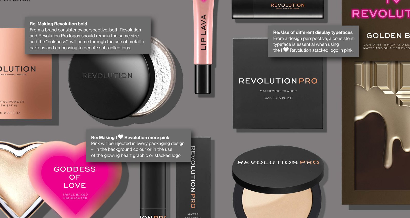
Hundreds of products, launched continuously, across multiple ranges and retail partners. New lines had to land fast, on trend, and still read as part of the master brand at arm's length on a shelf.
The brief, in practice, was a system rather than a set of one-offs: a visual language and a rulebook that anyone, in-house or at a supplier, could apply consistently as the range, the team and the business grew.
02 · ApproachA system, not a series of one-offs
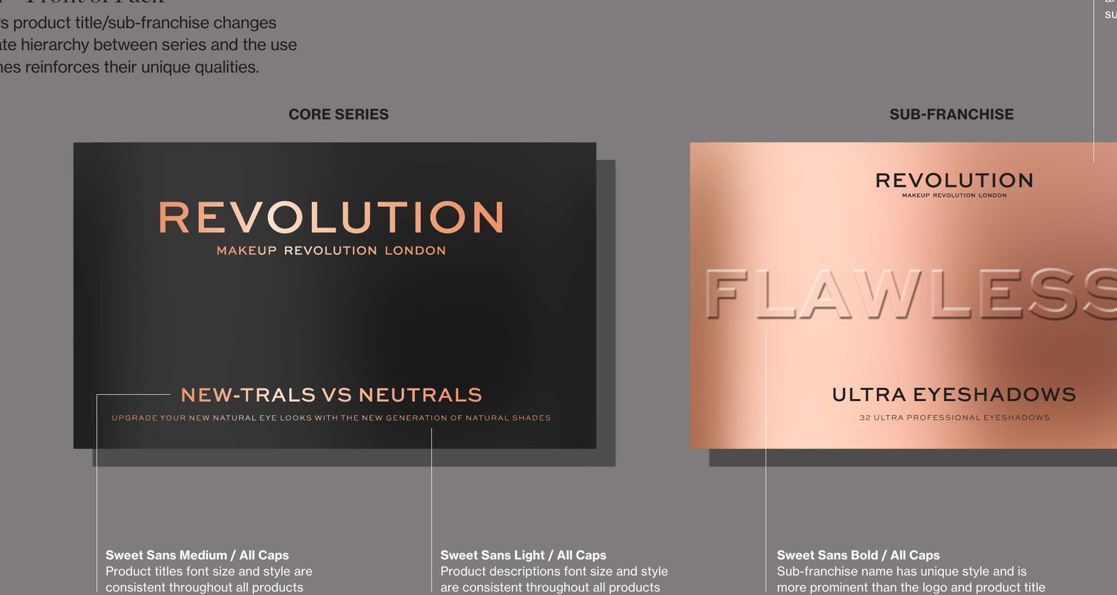
- Core identity and architecture. How the master brand relates to sub-ranges such as Revolution Pro and Obsession, so new lines launch quickly without flattening the whole.
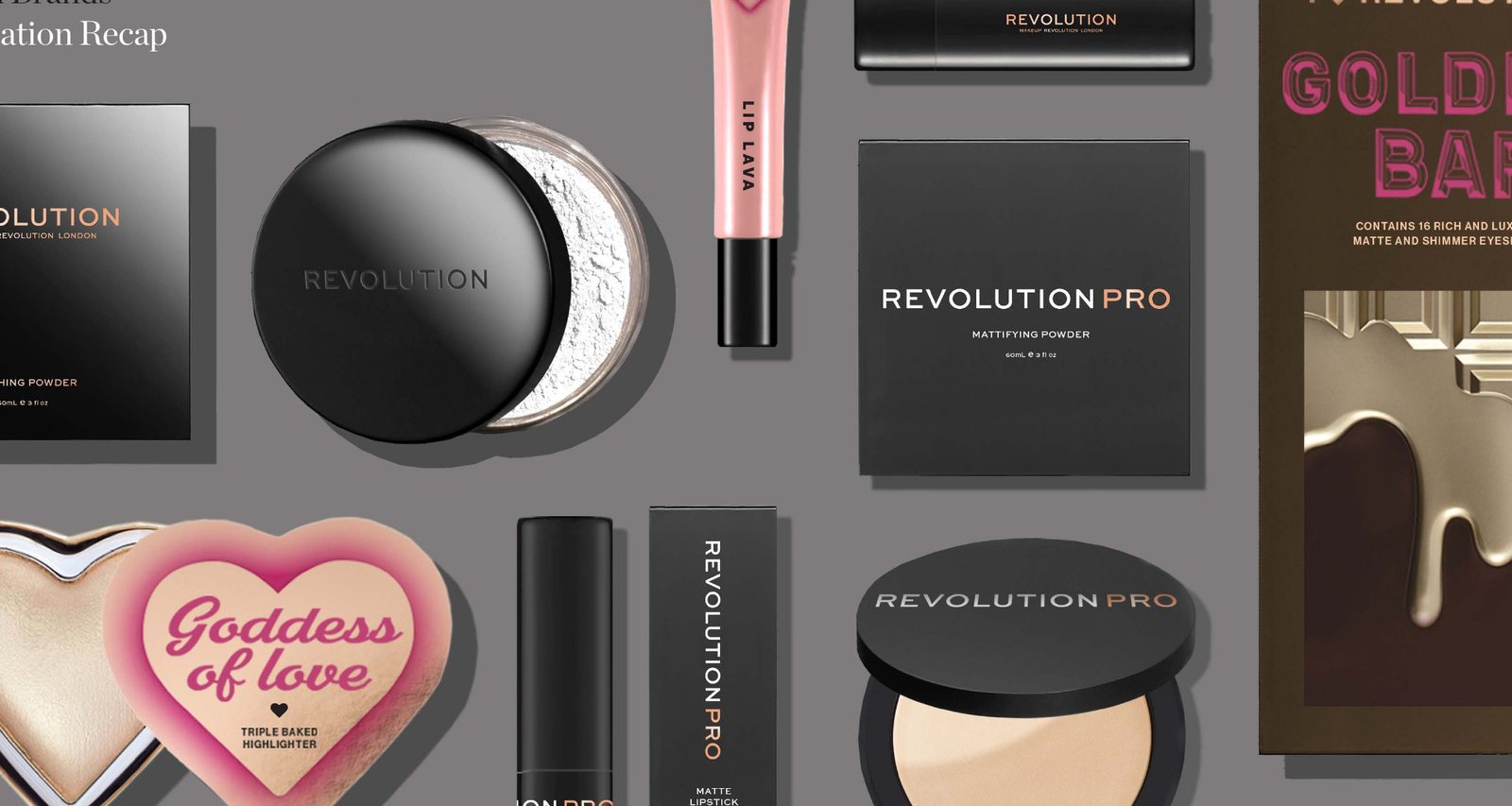
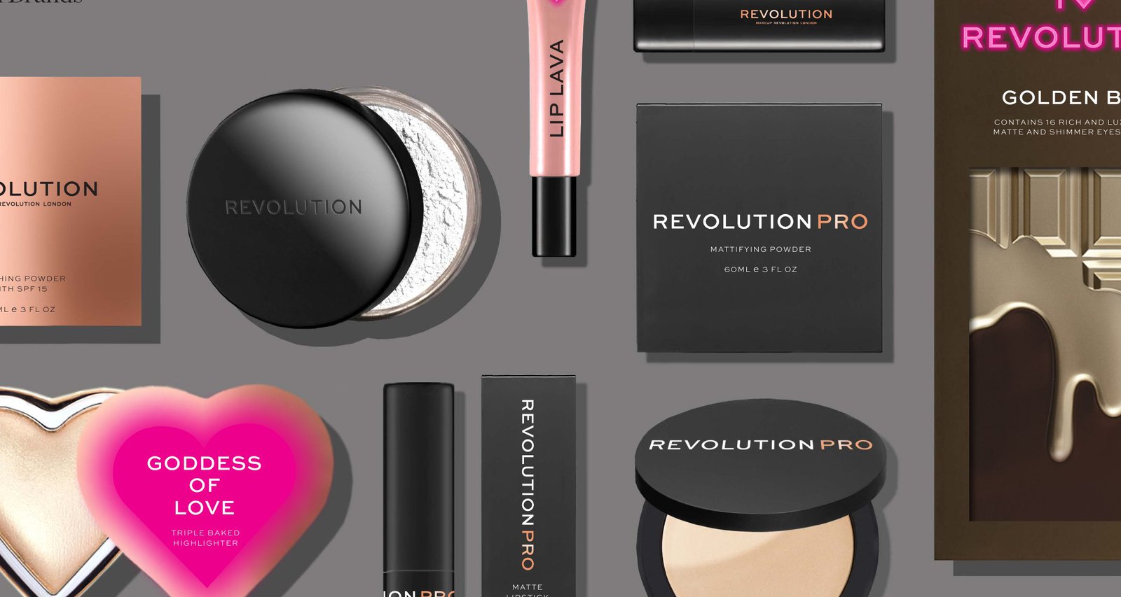
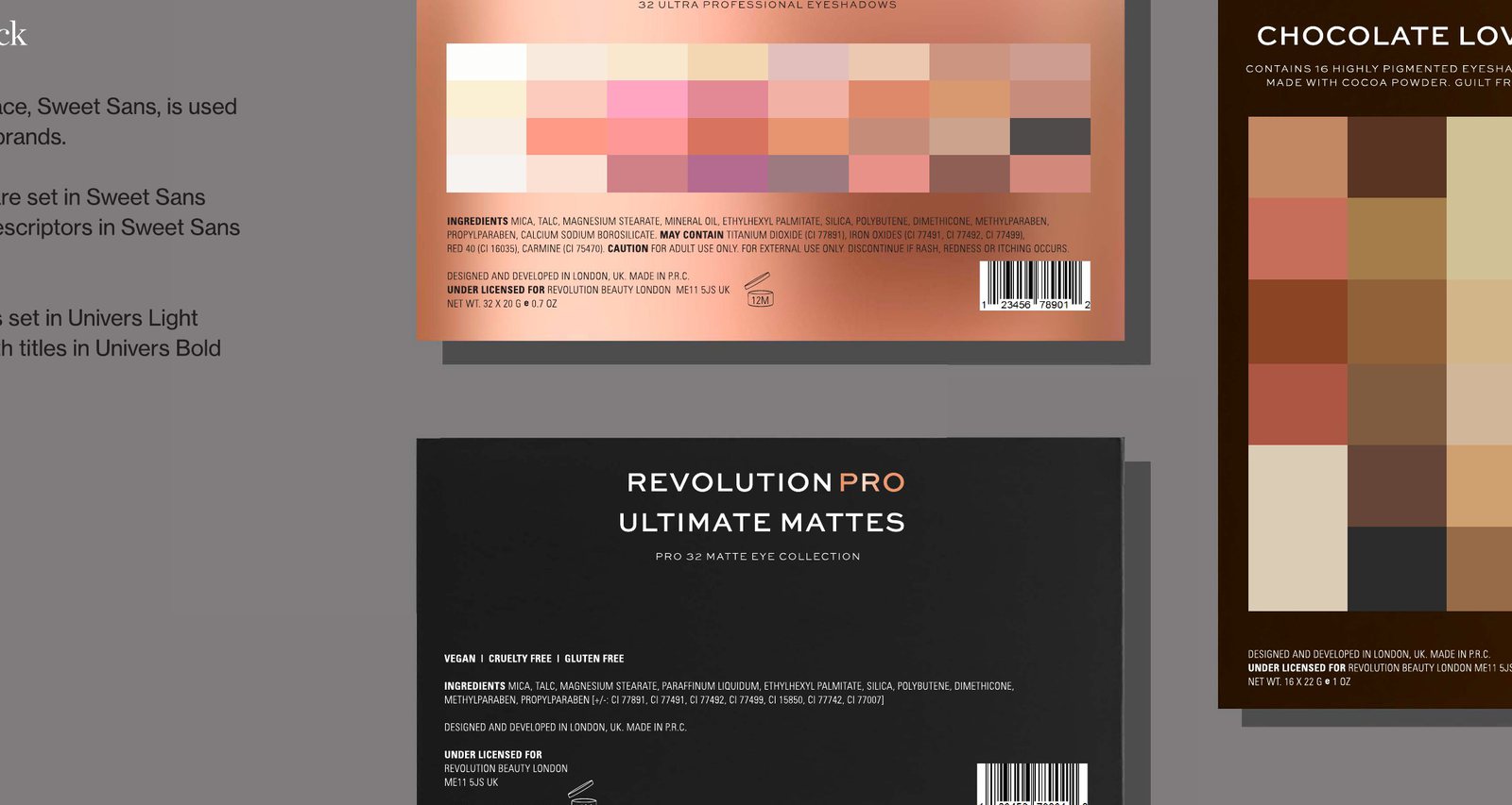
- Packaging system. Templated structures, typography, finish and information-hierarchy rules that scale from a single lipstick to a full gift set.
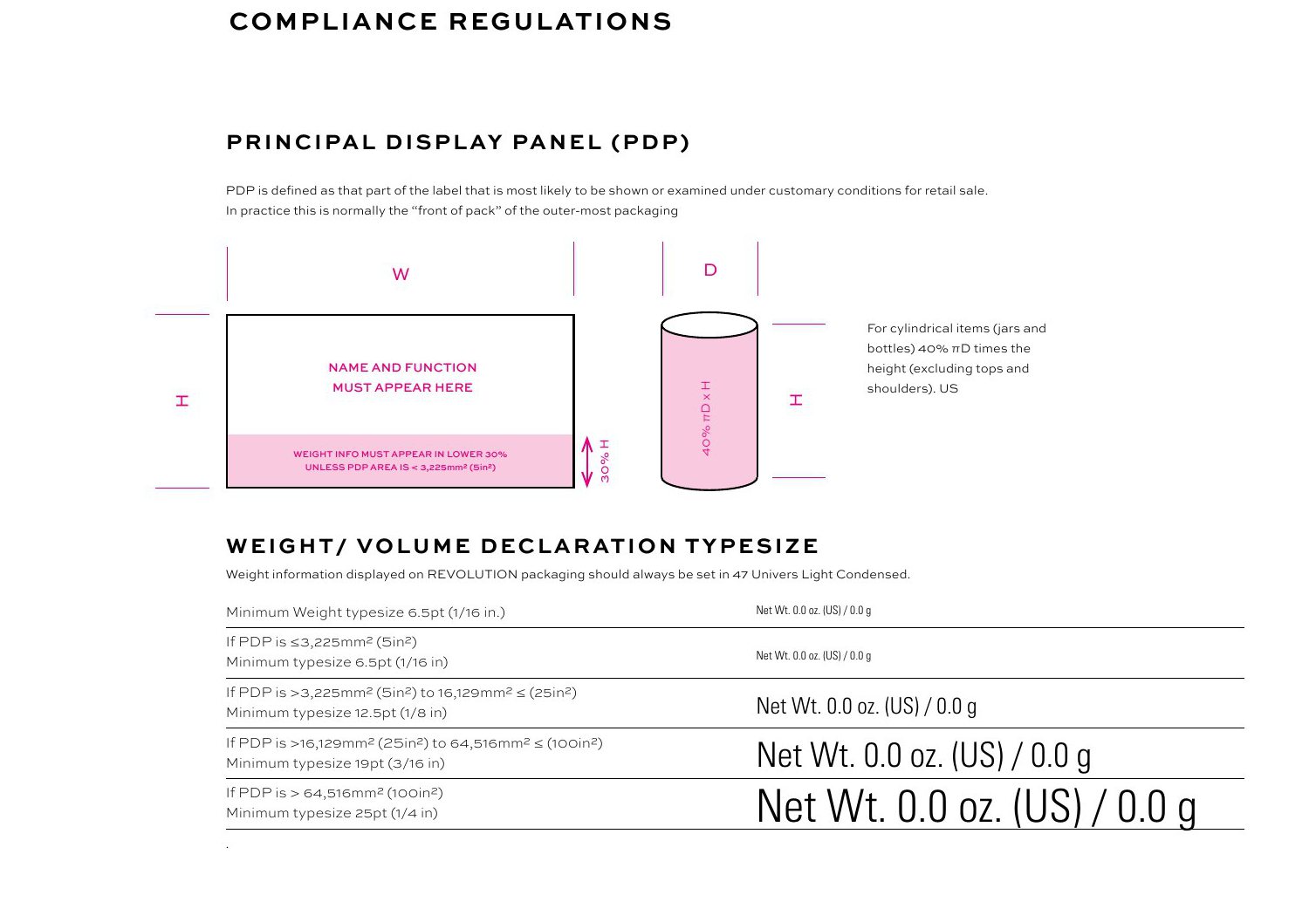
- Compliance built in. Principal display panel rules, weight and volume declarations and ingredient typesetting documented so regulatory detail never slowed a launch.
- Ongoing stewardship. Evolving the system as the business grew, keeping consistency intact through rapid expansion.
03 · OutcomeA brand that looked established before the business was
The packaging system was efficient enough to keep up with a relentless launch calendar, and the guidelines let the business and its supply chain produce on-brand work without a designer in the room. The same foundations carried the brand through to a £250m+ valuation.
Corporate packaging guidelines (PDF) Packaging & information hierarchy (PDF)