Work / Paragon Works
A brand refresh with six colour routes and one system
In late 2024 Paragon Works needed its visual identity brought up to date across presentations, social, reports and campaign work. I led the refresh: a darkened charcoal base with a family of six accent palettes, a typographic system built on bold statements, and a set of templates that let every team produce on-brand work without a designer.
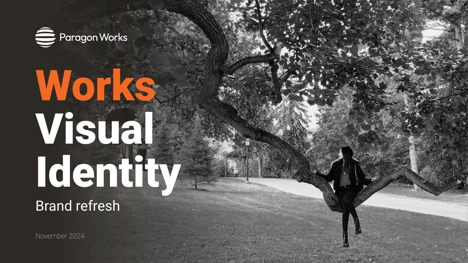
01 · The systemCharcoal base, six accents
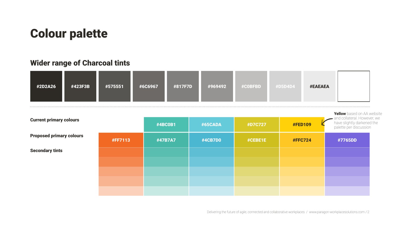
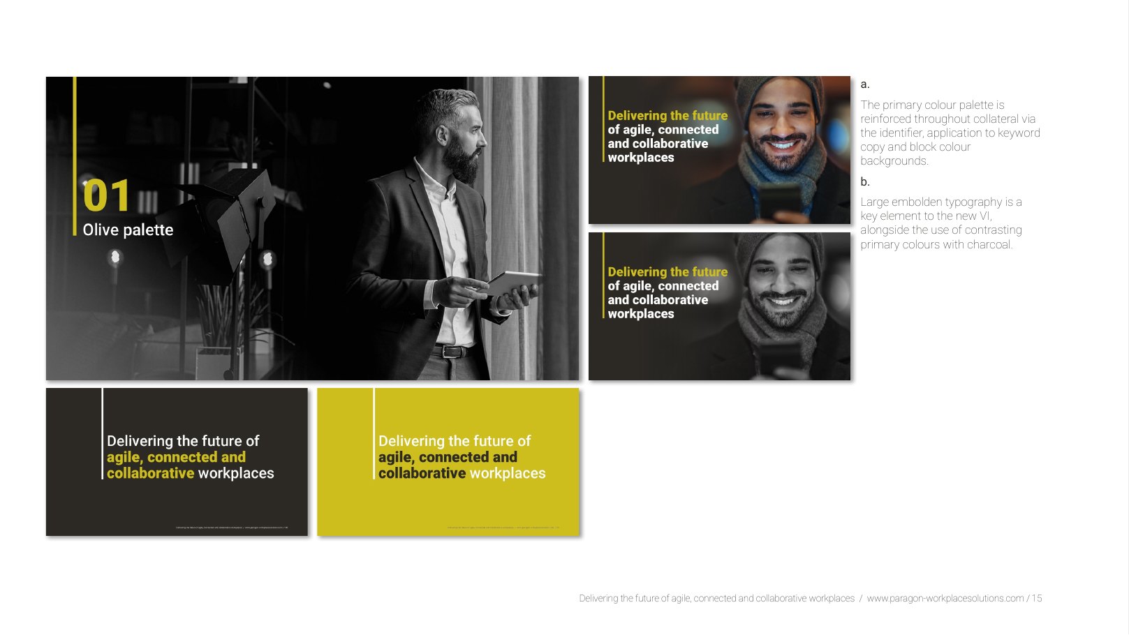
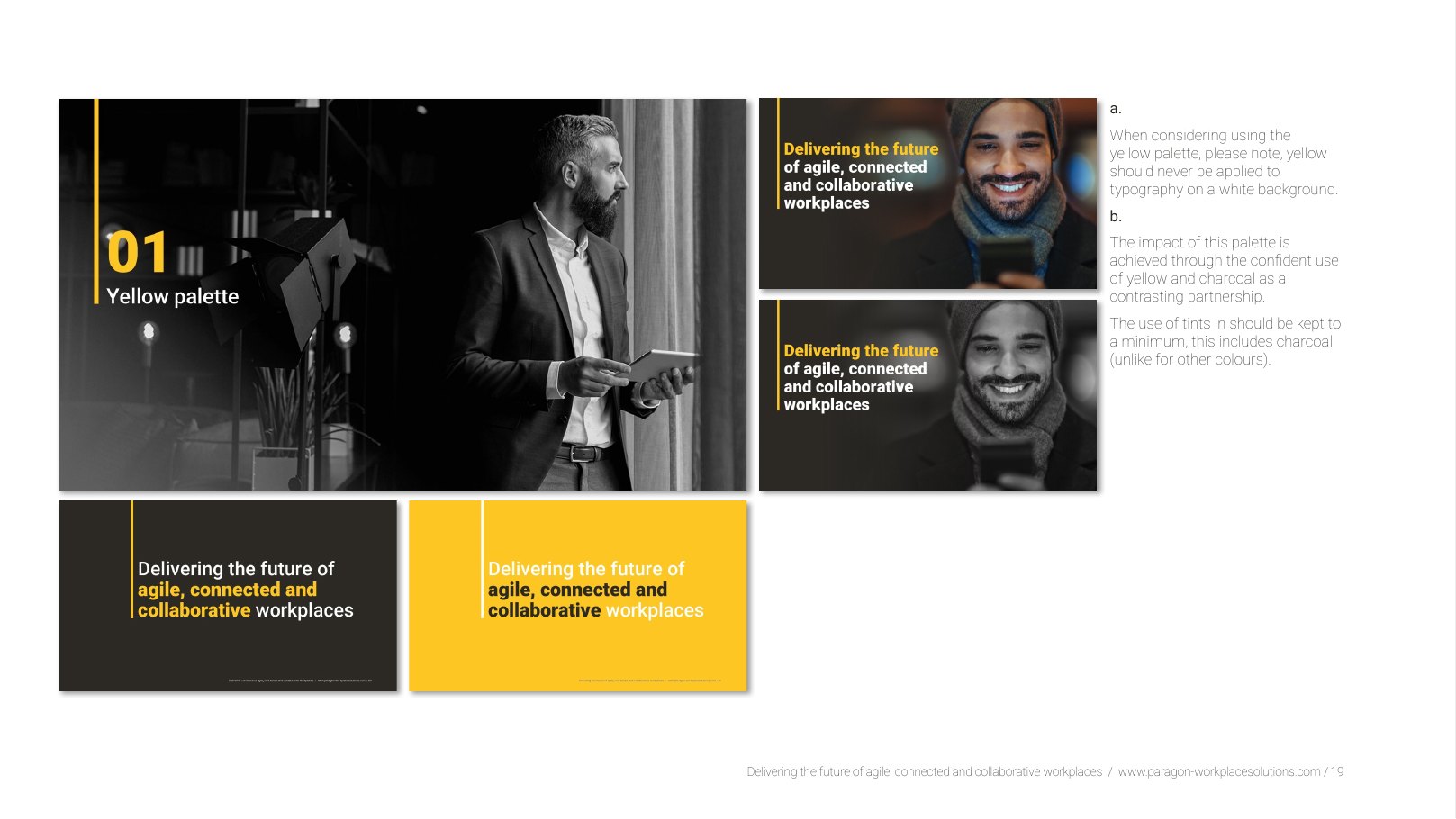
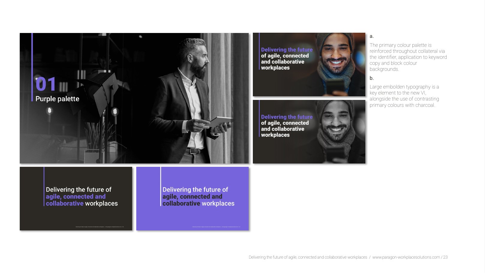
The refresh keeps the confident orange the group is known for but sets it inside a wider system: a range of charcoal tints for depth, and six accent routes (orange, blue, green, teal, yellow and purple) so each business line and campaign can own a colour while still reading as Paragon Works.
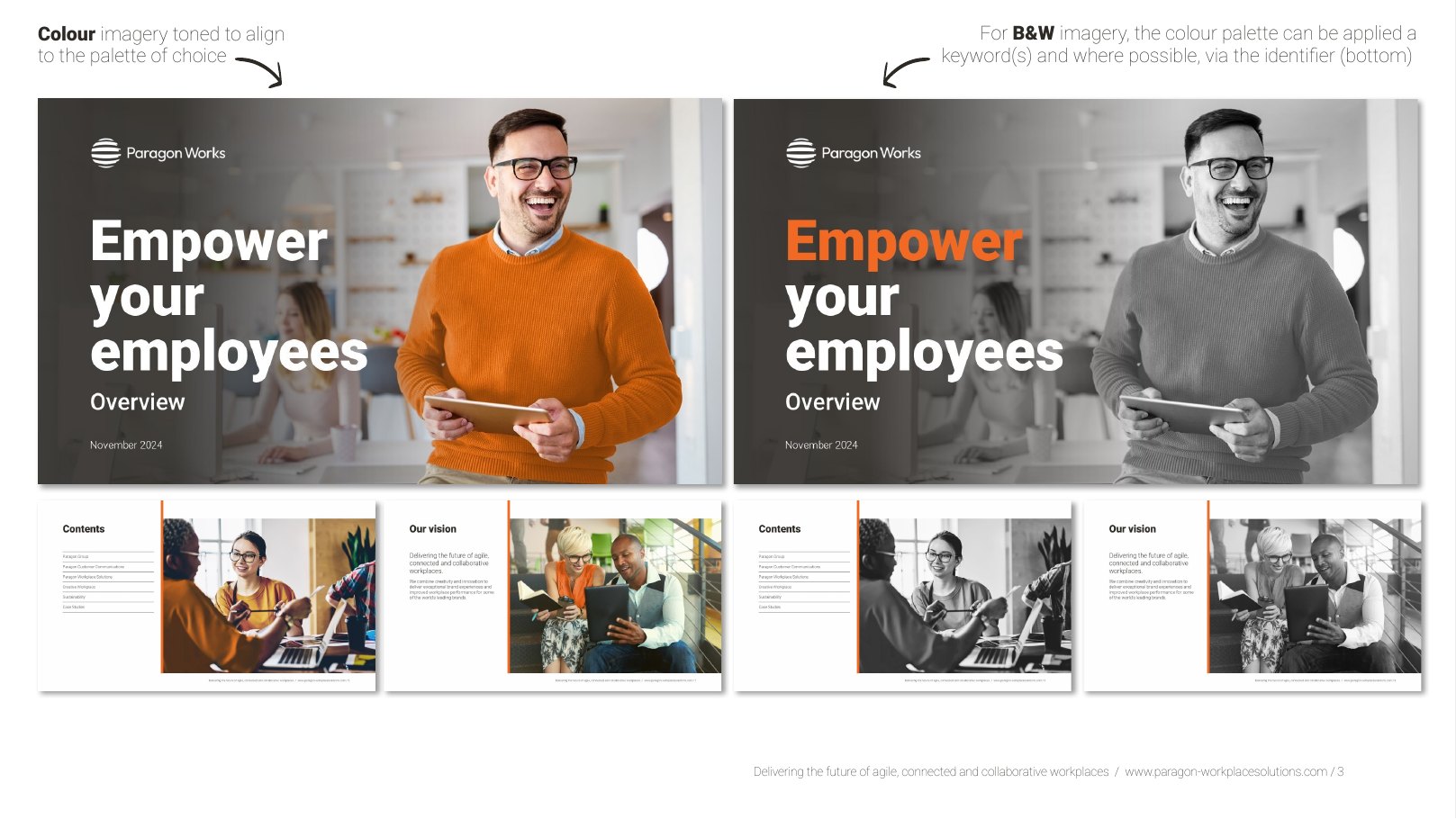
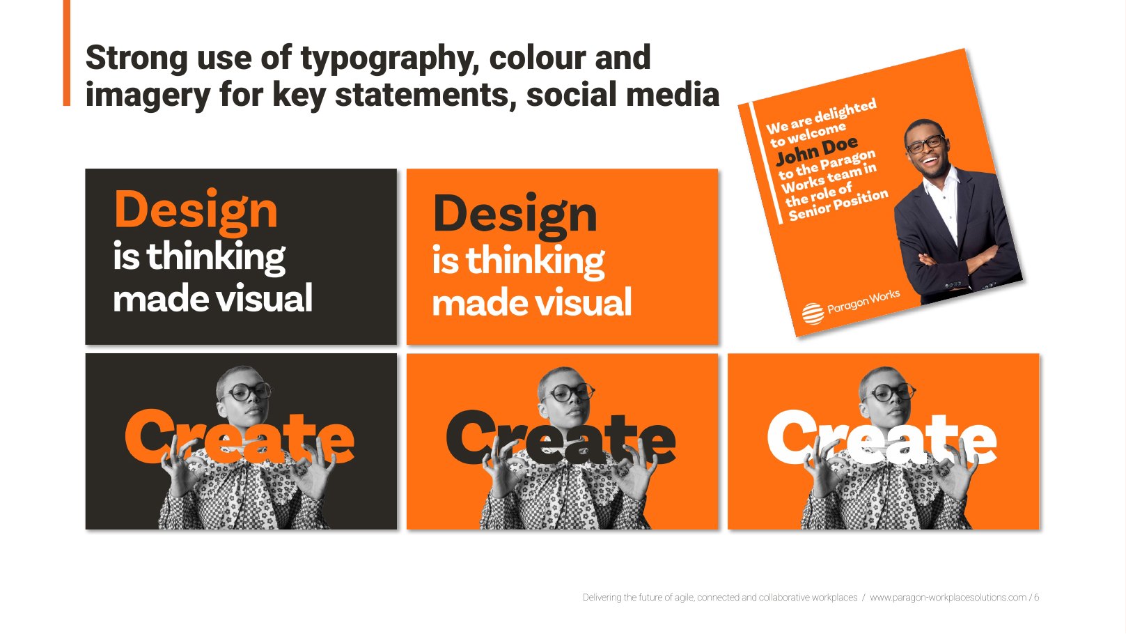
Every route was worked through the same set of applications: cover, statement graphics, social tiles, presentation slides and report pages, so the choice of palette never changes the structure.
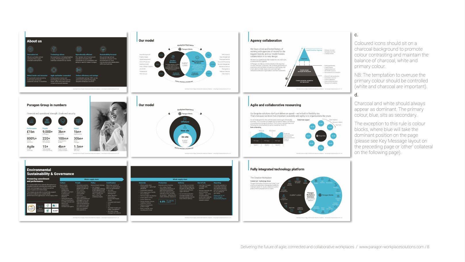
02 · The routesOne structure, six moods
Orange, blue, green, teal, yellow and purple. Same grid, same type, same photography treatment, different temperature.
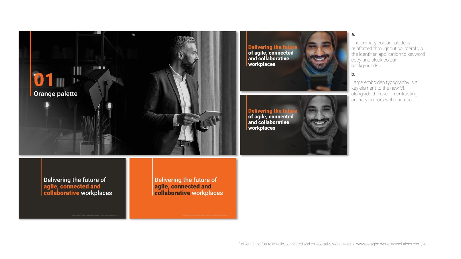
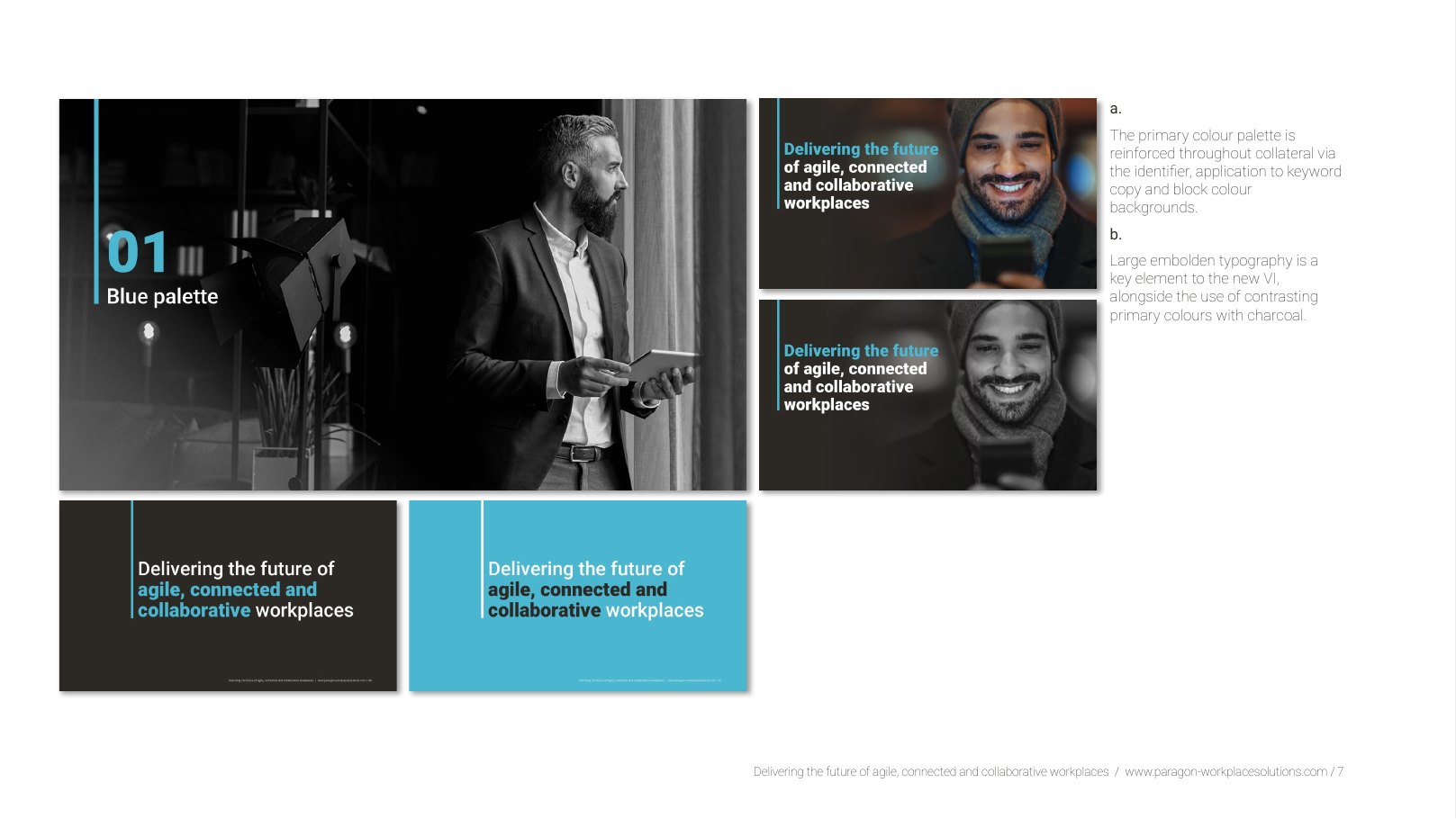
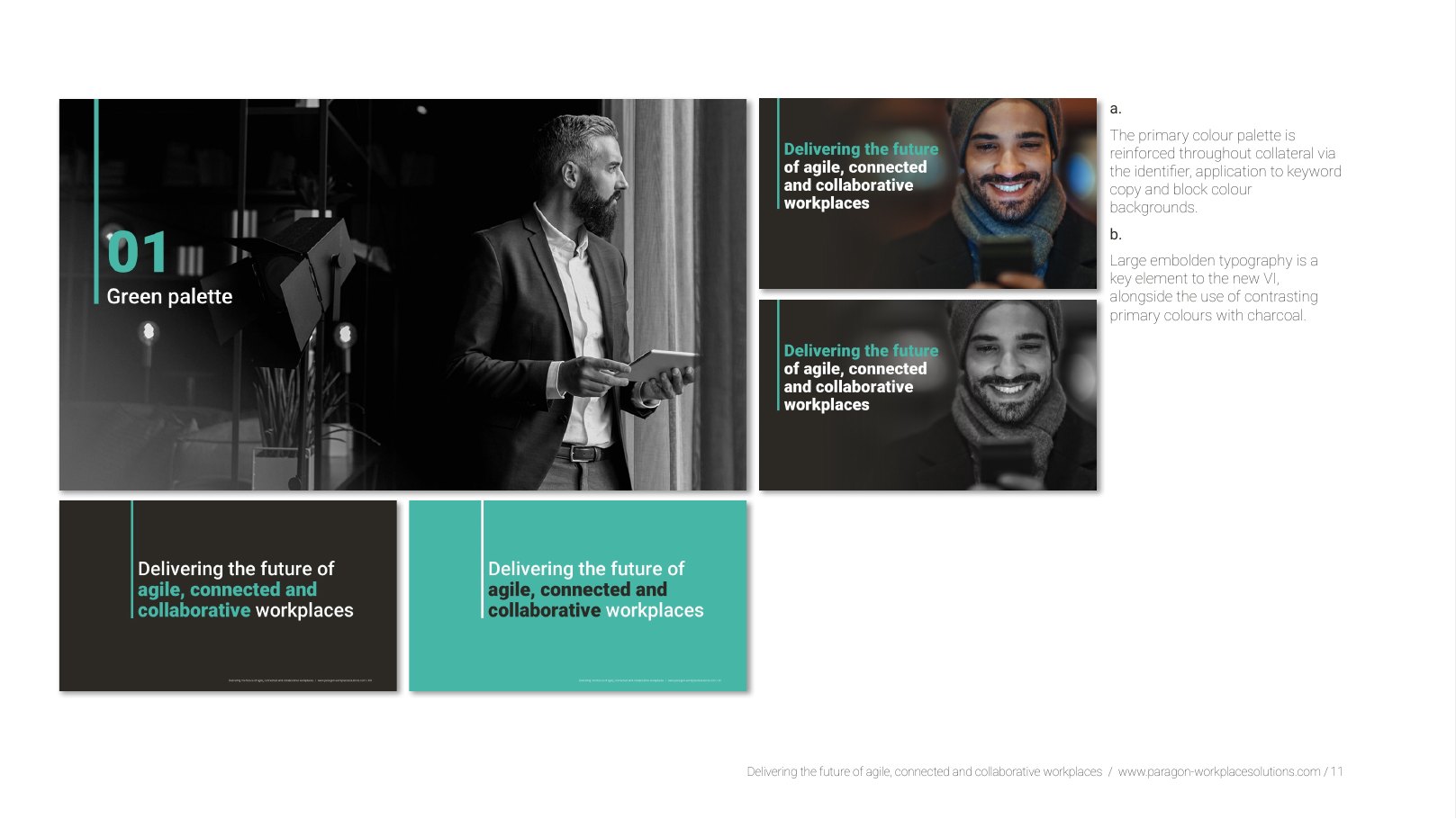
03 · OutcomeTemplates people actually use
The system shipped as a presentation deck, social templates and report layouts adopted across the group, and it underpins the paragon-works.com website and the Workplace Solutions brand film.